02 — TEAM ANALYSIS
The Problem
Hiring decisions depend on how a person will interact with an existing team, not just on their individual profile. Yet most tools only evaluate individuals in isolation.
Recruiters kept hitting the same wall: Will this person fit the team? Does the team have blind spots? Why do some collaborations work and others don't?
These weren't edge case questions. They were the questions that determined every final hiring call. No tool answered them.

The Solution
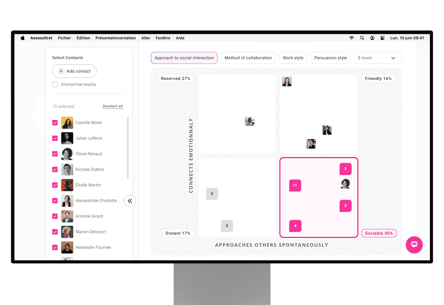
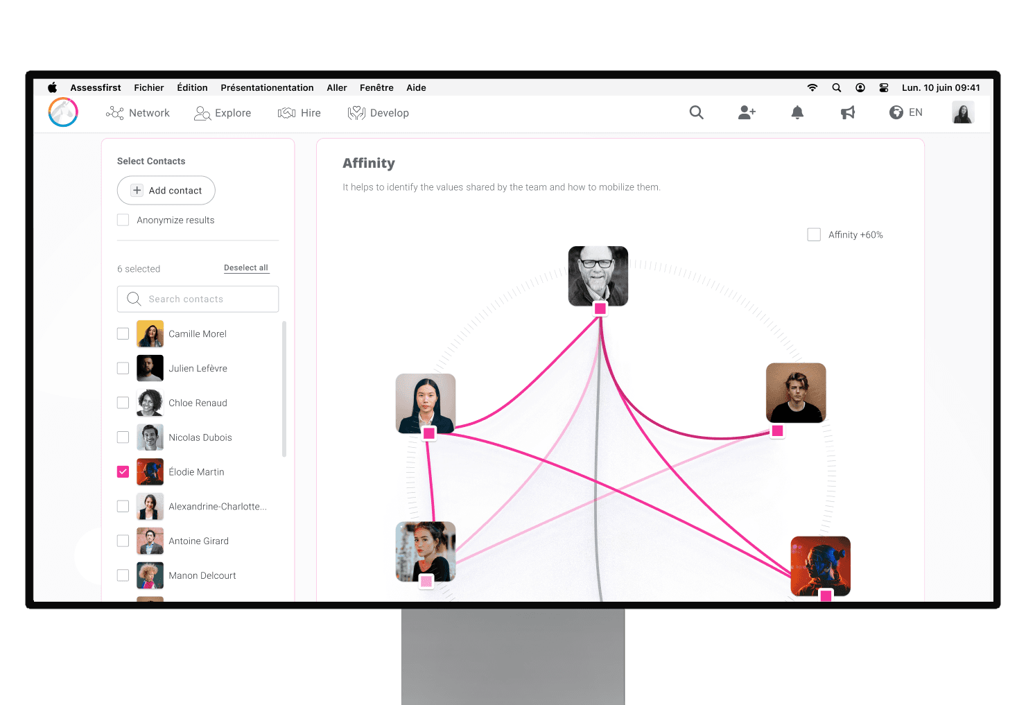
Team Analysis visualizes team dynamics across three psychometric dimensions.
Talent individual contribution styles, dominant patterns, team strengths and gaps. Culture shared values, alignment zones, fragmentation areas. Affinity probable relationships between members based on personality and motivations.
Each analysis generates AI insights that interpret the visualizations and surface actionable recommendations translating psychometric patterns into language managers can act on.

My Thinking
On turning a constraint into a design decision : The Science Team wanted a confirmation button before each team member addition, a legitimate concern given AI compute cost per action. Rather than adding friction to the flow, I proposed a transitional banner state: a persistent indicator that the analysis is pending, without forcing confirmation at each step. The constraint became the interaction pattern. We solved the cost problem without degrading the experience.
On what we chose not to build : Two ideas didn't make it, both for the same reason: complexity without proportionate value.
The first was a zoom interaction modeled on Google Maps, letting users scale the visualization by team size. In theory, elegant. In practice, the implementation cost and interaction complexity far outweighed the benefit. We cut it.
The second was the values radar. In early explorations, we included a radar chart for cultural values. At the size it needed to be to coexist with the rest of the profile, it was unreadable. A visualization that requires effort to parse defeats its own purpose. We removed it.
On a tradeoff surfaced in demos : During early demos with managers and sales teams, we hit a real tension: showing all team members at full size gave direct visual access but created immediate clutter. Reducing them to fit the view gained clarity but lost individual legibility. There's no clean answer, it's a tradeoff between immediate readability and analytical depth.
We chose to prioritize the overview first: a compressed view that shows the team as a system, with interaction available for users who need to go deeper. That call came directly from watching managers use the product in real time, they were scanning the whole before zooming into individuals.
Impact
During early demos, managers identified in real time why certain collaborations had been difficult. That moment of recognition became the sales team's strongest talking point.
Ships to production late April 2026.
Accessibility
Clusters and zones are differentiated by shape and label, not color alone. AI loading states are screen-reader friendly. Visual hierarchy was designed specifically to reduce cognitive overload — managers analyzing team dynamics are already processing complex information. The interface can't add to that load.
Key Learning
Hiring the right person isn't only about evaluating individuals. It's about understanding how people will interact, collaborate, and grow within a team.
The hardest design problems on this project weren't about the interface : they were about deciding what level of complexity was worth exposing, and what was worth absorbing on the user's behalf.
Scope of Work